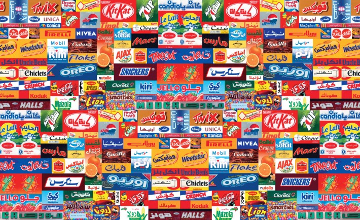
In today’s startup culture, there are a lot of logos floating around. The problem with the vast majority of them is that they are generic. Often they are mere placeholders that entrepreneurs think that they have to have in order to have a viable business. The worst situations are when a company goes to a logo generating website, chooses a logo that they like and then stick with it. Then they wonder why their customers can’t tell the difference between their business and the one just down the street offering the same range of products and services.
Here are some tips for helping your logo – the face of your company – stand out.
Make It Simple
Simplicity is one of the most important elements of any logo, says Jonah Berger, author of the book Contagious: Why Things Catch On. Take the old Apple logo, he says. This was once rainbow colored, but during that time, the company wasn’t iconic. The company then changed its logo to grayscale on a black or white background, and all of a sudden the company took off.
Of course, Apple needed a product too, but Berger emphasizes the fact that the new logo design made Apple easier to remember and more iconic. It’s important, Berger says, to limit the number of “moving parts” on a logo design. IBM, Coca-Cola, and IKEA all use very simple aesthetics which are easy for consumers to digest.
Memorability
Ask any advertising company, and they’ll tell you that a logo should be memorable. But making a logo both memorable and simple is not easy. Let’s go back to the Apple example. Apple could have gone with a regular apple symbol, but they decided instead to go with an apple with a bite taken out of it. Why did they do this?
According to Berger, it’s to create incongruity. People have seen millions of apples without bites taken out of them, so Apple’s logo wouldn’t stand out that much if it were of a whole apple. But thanks to the fact that it has a bite taken out of it, people are more likely to remember it. What’s more, the image is still very simple to remember, making it stand out from the rest.
Make It Remarkable
It’s all well and good having a logo that is straightforward and memorable, but the best advertisers know that “remarkability” is important too. According to Berger, this means using a logo that will get people talking and create intrigue.
One cool example is the search engine TalentBin which helps companies find quality personnel. Their logo is a cartoon squirrel riding a unicorn. It’s a bizarre image, but it contains a meaning that is familiar to the industry it serves. In the recruiting industry, the term “purple squirrel” is ascribed to people who are really hard to find. Using the symbol of a purple squirrel helps to emphasize the fact that TalentBin is always on the lookout for individuals who are generally hard to find. Berger suggests that startups might want to try a similar strategy.